Please, not another competitive comparison grid
August 12, 2015

As a video guy, I love things that move. Cars... Busy crowds... Birds... The tears running down my face while I watch the Patrick Swayze film Road House…
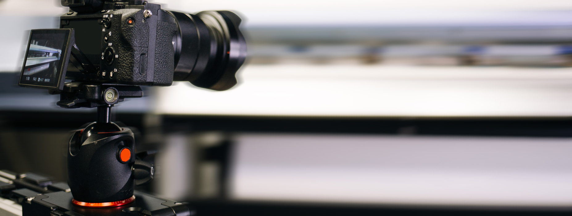
Things that move draw the eye and capture the attention (much like Swayze’s performance in the film). So, in every project I work on, I try to choose the most practical and interesting ways to move the camera.
One of the best ways to approach this is to treat the camera as a character. That character represents the audience. When I move the camera through the scene, I make the audience see what will best tell the story.
Which techniques you use will depend on the project and your vision, but I’ll show you the approach I use to decide how best to move the camera. Hopefully, you'll be able to use a similar approach to help you on your next project. (Or not. You could just throw it all aside like Swayze throws Wesley’s thugs around in Road House.)
First, let’s go through all the camera movements we have at our disposal.
Regardless of the project, I tend to use the same approach to decide where to place the camera and how to move it. Whether it’s a scene that’s part of larger narrative, a flashy video showcasing a product for a launch, or even an interview for a customer testimonial, I always start by asking, “How can the audience take in the information in the best and most natural way possible?”
There are a lot of different ways to answer. Some say you have to manipulate the audience to pay attention to what you want. I think of it more as introducing the characters, settings, and information as the piece goes on.
That’s where I start treating the audience as a character. How would they see the area around them? How would they see a new character being introduced? How would they look at a product component when prompted? I try to answer as many of these questions as I can before replacing the character with the camera.
The example below is called a “walk and talk,” made famous by the television show The West Wing. This handheld technique is brilliantly utilized as one seamless shot introducing the audience to an assortment of characters, the layout of the building they work in, and how hectic the environment of that workplace is, all while moving the story forward. It feels as if we are there following a character and exploring the White House ourselves.
In this example, we have a product overview showcasing different components and specifications of an HPE server. Here, we used different camera techniques—such as dollying, panning, and zooming—to simulate a curious person getting a closer look at the product and exploring every piece they would want to. This makes it easier for the audience to digest.
This example shows how we can add some interesting movement to an interview video. We introduce the subject while cutting to shots of b-roll showing things he mentions. Each shot of b-roll utilizes camera movement to simulate someone exploring the data center where this video takes place.
I’m just a humble man who enjoys making videos and watching Road House, but throughout my career, I’ve found that treating the camera as a character works best for me and my projects.
If you find yourself wondering on your next project about which camera placement or movement to use, try thinking of how that character would move around or be introduced to another character, scene, or product.
At the end of the day, just get out there, do something, and have fun.
We take pride in a team loaded with smarts, wit, and ideas. If you'd like to have a smarter, wittier inbox filled with ideas each month, subscribe here to the MarketReach Blog, and we will let you know when there is something new you might like!

Need us now? Just want to learn more? We’d love to talk.