My college design studies indoctrinated me into the Adobe trinity (Illustrator, Photoshop, and InDesign). At MarketReach, we once relied on these programs for all our web design work.
Photoshop updates slowly kept up with some of our growing needs, such as support for multiple artboards, but it felt like an afterthought in a software program originally intended for photo editing. While it is possible perform web design in Photoshop, the experience is not necessarily ideal. So, we started to explore new design software options.

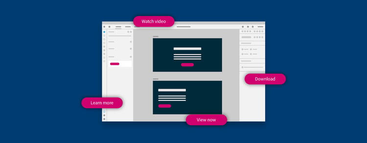
Buttons added to component libraries in the Assets panel are a breeze to use in Adobe XD.
Software that checks all the right boxes
We wanted to improve our process, and how we shared functionality and ideas among the team and with clients. We wanted a program with solutions for libraries, wireframes, mockups, and prototypes. We also needed to present or share pages and allow internal and external reviewers to communicate feedback. On top of that, we wanted to export various elements from the mockups.
We checked out several software options, but three key benefits of Adobe Experience Design (XD) brought it to the forefront:
- It was included within Adobe Creative Cloud, which we were already paying for.
- We could work on designs and add interaction in the same program, and then share prototypes over the web, making it easier to present to a client or provide their teams a link.
- It worked with both Windows and Mac.
But running Adobe XD through the rigors of actual use was the true test of whether it would work for us. Here’s what we found.
Work more efficiently with Adobe XD
With Adobe XD, we work more efficiently through iterative designs using components we create along the way, from style guides to full-fidelity layouts. We can update components, much like updating CSS, and see that change applied globally, which saves us from making the same changes repeatedly.
We can update style guide components from a separate document and see those changes take effect in the layout. It is also much easier to quickly select from character styles we have established in the Assets panel of the program—from a headline 1 (<h1>) down to a paragraph (<p>)—with a simple click.

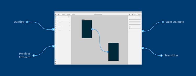
The Prototype tab makes it easy to bring static mockups to life.
Prototypes that act like the web
The Adobe XD prototyping feature is invaluable for communicating how certain web pages link or how other mechanical elements function. For example, we can show a client how their navigation will have a fixed position on the top of a page while scrolling or how a button click will trigger a modal window to appear.
“It can be difficult for clients to imagine the transitions
from page to page. XD allows our clients
to walk through their site before it’s developed.”
—Eryn Mahoney, Senior Graphic Designer
With Adobe XD, our work with the development team has become much more collaborative. Through the simplified UI, we can iterate more efficiently side-by-side with developers. Because of that, we can take advantage of features like prototyping and desktop previews. Understanding what both sides are trying to achieve helps mitigate inconsistencies between the design and development phase.
To this day, we use XD as our daily driver for front-end design work. We still use Photoshop to edit photos for the web, but we use it with Adobe XD. The files are lighter and open quicker, making updates and sharing easier.
We can work confidently knowing we can focus more on the work and less on the software. Now we can use the time we used to lose in Adobe Photoshop more effectively in Adobe XD.